
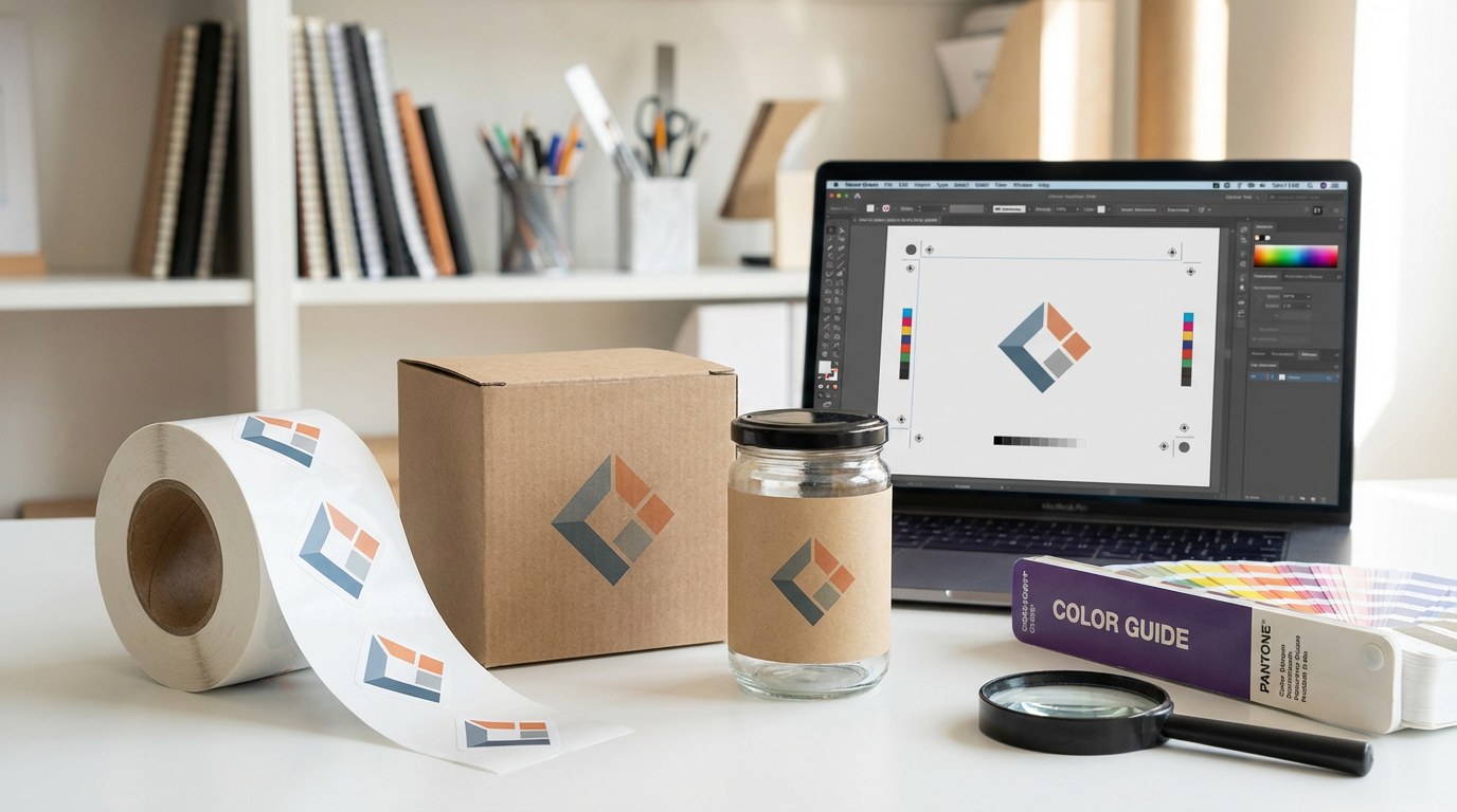
A print-perfect logo keeps your brand looking sharp on every sticker, label, or package. When your logo is built and delivered the right way, your colors stay consistent, text stays crisp, and production runs smoothly.
This guide walks you through artwork, branding, and prepress basics so your logo is truly print-ready the first time.
What “Print-Perfect Logo” Really Means
A print-perfect logo is more than a nice design on a screen. It’s artwork that:
- Scales to any size without losing quality
- Uses correct color modes for print
- Has clear, readable text and details
- Arrives to your printer in the right file formats
When your logo hits all these marks, you avoid blurry prints, off-brand colors, and costly reprints.
Choose the Right Logo File Types for Printing
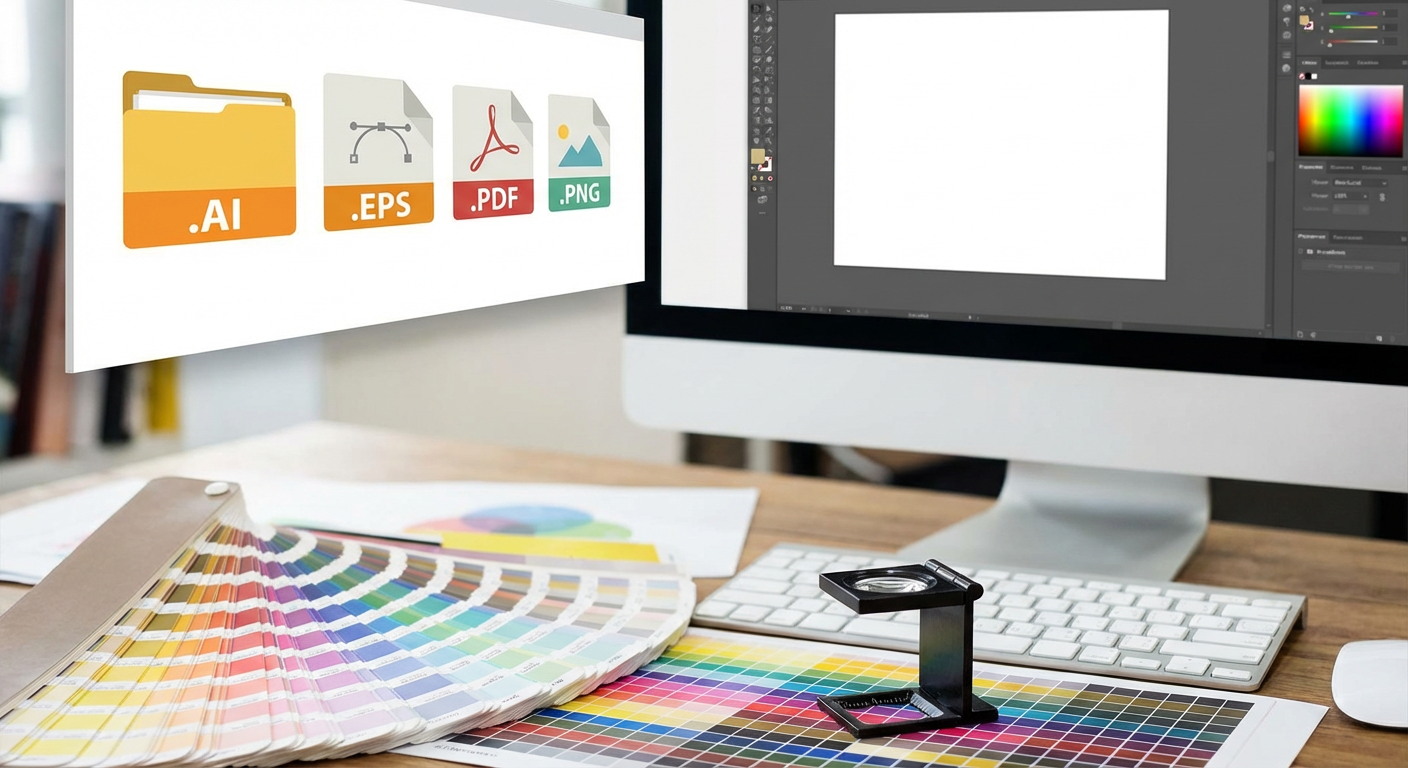
Not all file types are created equal. Choosing the right format is one of the fastest ways to get a print-perfect logo.
Vector vs. Raster: Why It Matters
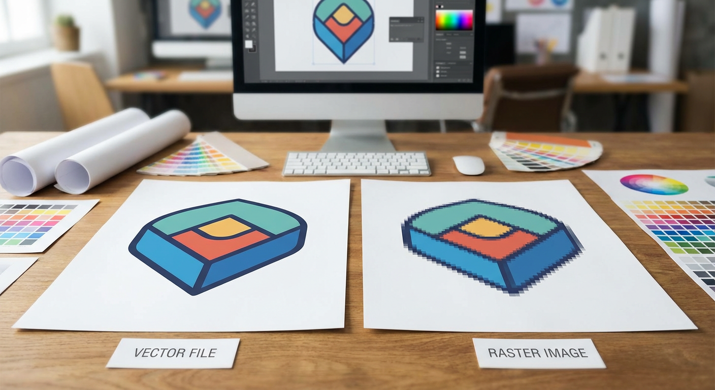
Your logo should always be built and saved as vector artwork for print.
- Vector files (AI, EPS, PDF, SVG) use paths and shapes. They scale from a small sticker to a large banner without getting blurry.
- Raster files (JPG, PNG, TIFF) use pixels. They can look great at small sizes but will pixelate if enlarged.
For best results, always provide a vector version of your logo to your printer.
If your logo only exists as a low-resolution JPG or PNG, ask your designer to recreate it in vector format before placing print orders.
Best File Formats to Send Your Printer
Aim to provide:
- AI or EPS: Ideal source files for professional printers
- PDF (vector): Widely compatible and easy to proof
- High-resolution PNG: Helpful for digital previews or mockups
When in doubt, send both a vector PDF and the original AI/EPS file so your production team has options.
Color Setup: CMYK, Spot Colors, and Brand Consistency
A print-perfect logo keeps your brand colors consistent across every order. That starts with using the right color modes and values.
CMYK vs. RGB: Screen vs. Print
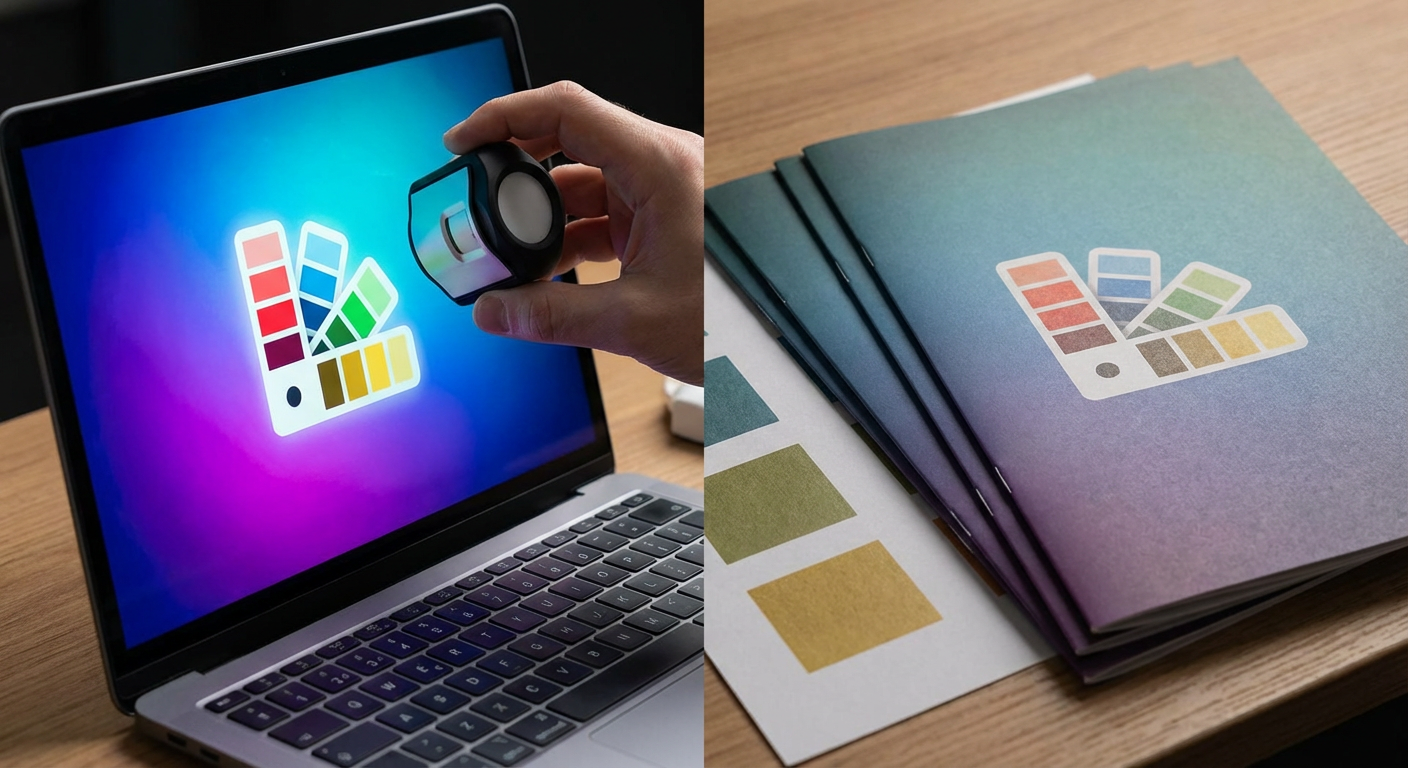
- RGB is for screens (phones, monitors, web).
- CMYK is for print (stickers, labels, packaging).
If your logo was designed in RGB only, colors may shift when printed. Always request a CMYK version of your logo for any print project.
Spot Colors and Pantone Matching
If color accuracy is critical, talk to your printer about spot colors or Pantone Matching System (PMS) inks. These are pre-mixed inks used to hit very specific brand colors.
Provide:
- Pantone (PMS) codes for your brand colors, if you have them
- A CMYK breakdown for each logo color
This gives your printer a clear target when matching your brand.
Keep a Simple, Print-Friendly Palette
Logos with too many colors can be harder and more expensive to print. When possible:
- Limit your primary logo to 2–3 main colors
- Avoid extremely light tints for small text
- Ensure there’s enough contrast between foreground and background
A clean, simple palette almost always prints better and looks more professional.
Typography: Make Sure Your Logo Stays Readable
Your logo’s text should be clear at both small and large sizes. That means choosing the right fonts and preparing them properly for print.
Choose Fonts That Print Cleanly
For a print-perfect logo, pick fonts that:
- Stay readable at small sizes
- Have clear letter shapes and good spacing
- Don’t rely on ultra-thin strokes for key text
Decorative or script fonts can work for short brand names but may become hard to read on small stickers or labels.
Outline or Package Your Fonts
When artwork moves between computers, missing fonts can cause your logo to change or break. To prevent this:
- Convert text to outlines in your vector file once the design is final
- Or package your fonts if your printer asks for them
Outlining text locks in the shapes of your letters so they render exactly as designed.
Always keep an editable version of your logo with live text before outlining, so you can update it later.
Sizing Your Logo for Different Print Uses
A print-perfect logo should look sharp on everything from small labels to full mailers. Planning for different sizes makes that possible.
Minimum Size Guidelines
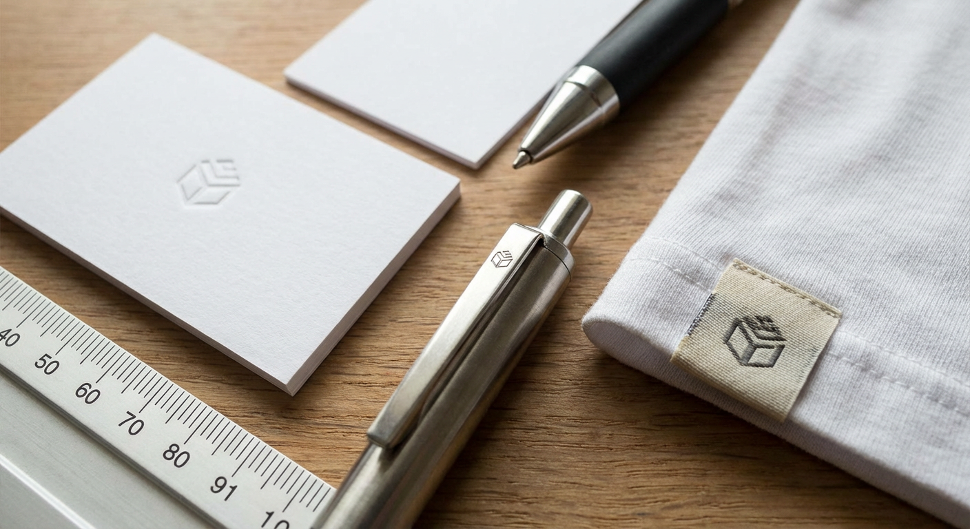
Tiny logos can quickly become unreadable. As a general guide:
- Keep key text large enough to read at a glance
- Avoid taglines or fine print on very small labels
- Simplify the logo for small-scale uses when needed
Many brands create a primary logo and a simplified mark (like an icon or monogram) just for small spaces.
Provide Multiple Logo Versions
To keep your brand flexible and print-ready, create and store:
- Full logo (icon + wordmark + tagline, if used)
- Horizontal and stacked versions
- Icon-only or monogram version
- Light and dark versions for different backgrounds
Having these ready makes it much easier for your printer to place your logo where it looks best.
File Setup and Bleeds for Print
Even a perfect logo can run into issues if the file setup isn’t dialed in. Basic prepress practices help avoid white edges or cut-off artwork.
Safe Area, Trim, and Bleed
Before sending your logo on a sticker or label layout, check:
- Safe area: Keep important text and logo elements away from the edge.
- Trim: This is the final cut size.
- Bleed: Extra artwork that extends beyond the trim so color goes edge to edge.
Ask your printer for their bleed and margin specs and set up your file to match.
Resolution for Raster Elements
If your logo has any raster elements (like a photo or texture), make sure they’re high resolution.
- Aim for at least 300 dpi at 100% print size for any raster parts
- Avoid upscaling small web images for print
When possible, keep your core logo elements vector-based to stay crisp.
Approvals and Proofing: Catch Issues Before You Print
A print-perfect logo is as much about process as it is about design. A solid approval workflow prevents surprises.
Always Review a Proof
Before production starts, your printer will usually provide a digital proof or printed sample.
Check the proof for:
- Logo placement and size
- Color appearance (within the limits of a screen)
- Spelling and layout
If color is critical, ask if a press proof or color swatch is available.
Get Internal Sign-Off
Make sure the right people have eyes on your logo before it goes to print.
- Share the proof with your team or stakeholders.
- Confirm the logo, colors, and layout match your brand standards.
- Document the final sign-off so you can repeat successful orders later.
Keeping a record of approved proofs makes reorders faster and safer.
Keep a Central Logo Toolkit
To consistently produce a print-perfect logo, build a simple logo toolkit your team can access.
Include:
- Final vector logo files (AI, EPS, PDF)
- High-resolution raster files (PNG, JPG)
- Color values (CMYK, RGB, and Pantone if available)
- Logo usage rules and spacing guidelines
Store these in a shared folder or asset library so designers, marketers, and printers are always working from the same source.
A clear, organized logo toolkit is one of the easiest ways to protect your brand in print and digital.
Work With a Printer Who Understands Branding
Even the best-prepared artwork benefits from an experienced production partner. A printer that understands branding can help you:
- Spot potential issues before they go to press
- Recommend the best materials and finishes for your logo
- Match your colors as closely as possible across runs
When you’re ready to turn your logo into premium stickers, labels, or packaging, the team at Fresh Prints Supply can help you bring a print-perfect logo to life on every order.