
The t-shirt print placement size chart is the fastest way to choose standard measurements that look right on real bodies—whether you’re printing a full front graphic, a left chest logo, or sleeve text.
If your design is even an inch too big or too low, it can look off-center, get swallowed by seams, or feel awkward across sizes. This guide gives you practical sizing ranges for front, back, chest, and sleeves, plus simple placement steps to avoid common mistakes.
Quick takeaways: On most adult unisex tees, a standard full front print is 10–12 in W × 12–16 in H, starting about 2–3 in below the collar seam. A left chest logo is usually 3–4 in on the longest side. A full back is often 11–13 in W × 14–16 in H, also starting 2–3 in below the collar seam. A sleeve print commonly runs 2.5–4 in on the longest side.
T-Shirt Print Placement Size Chart (Quick Reference)
This chart lists common print area dimensions (the ink/transfer size), not the garment’s tagged size.
Two shirts labeled “L” can fit differently. Chest width, collar depth, and side seam shape all change what looks centered and proportional.
Print method matters
- Screen printing: limited by screen size and press setup.
- DTG: limited by platen size and print head travel.
- DTF: limited by transfer sheet width and trimming tolerance.
For file setup, many shops request 300 DPI raster at final size when you aren’t using vector. For background, see Adobe’s guide to image size and resampling.
Standard placement zones (covered in this chart)
- Full front: large center graphic on the front torso.
- Center chest: mid-size graphic centered on the chest.
- Left chest: small logo over the wearer’s left chest (pocket area).
- Upper back/yoke: small mark centered under the back collar.
- Full back: large center graphic on the back torso.
- Sleeve: logo/text on the left or right sleeve.
Expect variation: Crew vs. V-neck changes how “2 inches below the collar” looks. Oversized fits make standard prints look smaller. Women’s fitted and youth tees reduce usable width and length.
How to use the chart before you design
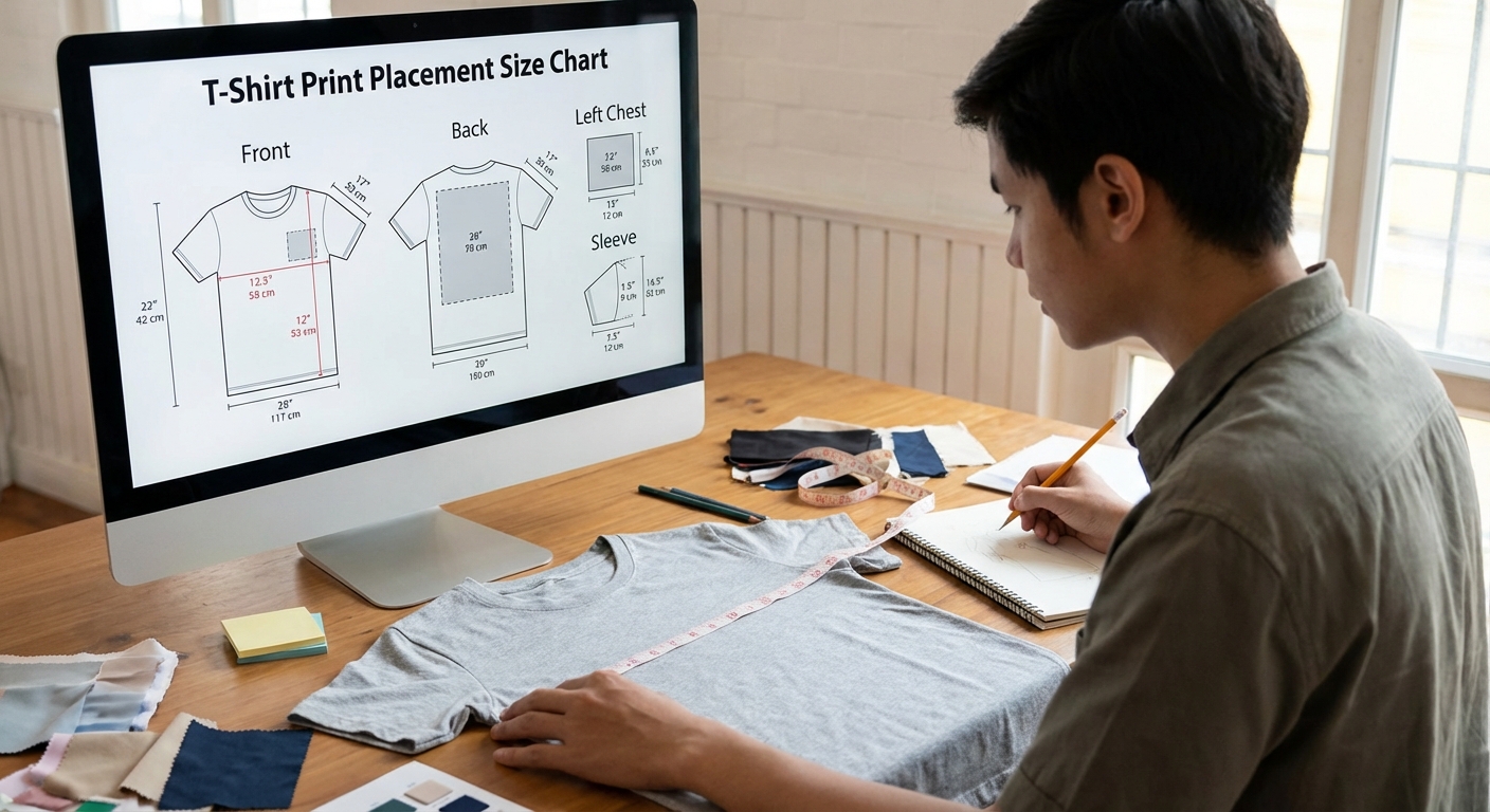
- Choose the placement (brand mark vs. large illustration vs. name/number).
- Confirm maximum printable area with your printer (platen/screen/transfer width and height).
- Pick alignment references (centerline fold, collar seam, shoulder seams, armpit seams).
- Plan clearance from the collar and side seams so art doesn’t warp or disappear into curves.
Standard Front Print Placement: Sizes & Measurements
Front prints are the most noticeable because the eye compares the graphic to the collar opening and the body’s centerline.
Measure on a flat shirt and reference the collar seam (not the top edge of the shirt laid flat, which varies by collar).
Full front graphic (most common)
A standard full front print should stay clear of the armpit curve and avoid wrapping into the side seam area.
- Adult S–M: ~9–10.5 in W × 11–14 in H
- Adult L–XL: ~10.5–12 in W × 12–16 in H
- Adult 2XL–3XL: ~12–13.5 in W × 14–16.5 in H
- Top of print from collar seam: typically 2–3 in
As a baseline, keep ~1–1.5 in of breathing room from the side seams on standard fits.
If your art includes fine text, size it for real viewing distance. For a practical overview of readability, see Nielsen Norman Group’s notes on legibility and readability.
Center chest / mid-size front print (minimalist graphic)
Center chest prints are forgiving when you need one print size across many garments.
- Typical size: ~6–9 in W × 6–9 in H
- Top of print from collar seam: ~3–4 in
- Best for: wordmarks, icons, minimalist brand marks
Placement tip: If the design is only one short line, don’t automatically shrink it. Keep it readable, then adjust letter spacing and layout.
Oversized or “jumbo” front print (streetwear look)
Oversized prints push toward the garment edges. They can look great, but they’re most likely to hit equipment limits.
- Typical jumbo range: ~12–15 in W × 16–19 in H (equipment-dependent)
- Top of print from collar seam: ~1.5–2.5 in
- Main risks: crowding side seams, distortion on S–M, harder centering
Best practice is to create at least two versions (for example, S–M and L–3XL). If you must keep one size, cap width so it doesn’t wrap past the chest plane on smaller bodies.
Standard Back Print Placement: Sizes & Measurements
Back prints can often run slightly larger than front prints because the back panel is flatter.
The most common mistake is printing too low. Start from the back collar seam, not the hanger crease.
Full back print (event tees, merch)
- Adult S–M: ~10–11.5 in W × 12–15 in H
- Adult L–XL: ~11–13 in W × 14–16 in H
- Adult 2XL–3XL: ~12.5–14 in W × 14.5–17 in H
- Top of print from collar seam: typically 2–3 in
If the back includes lots of small text (sponsors, schedules), prioritize spacing and hierarchy. For contrast basics when choosing ink colors, reference WCAG contrast guidance.
Upper back / yoke print (small logo under collar)
Yoke prints are ideal for subtle branding and pair well with a left chest mark.
- Typical size: ~3–5 in W × 1.5–3 in H
- Placement: centered, ~1–2 in below the back collar seam
- Common combo: left chest front + yoke logo
Back name + number layouts (teams, staff shirts)
These layouts need clear spacing so they read from several feet away.
- Name (upper back): ~10–12.5 in W × 2–3 in H; start ~2 in below collar seam
- Number (center back): ~8–12 in W × 10–14 in H
- Spacing: leave ~1–2 in between the name baseline and the top of the number
Production note: Use high-contrast ink and avoid ultra-thin strokes. On dark garments, ask your printer about underbase (screen) or an opaque transfer (DTF).
Left Chest (Pocket Area) Print Placement: Sizes & Measurements
Left chest logos should look intentional, not like a sticker.
For consistent results, document your method (from collar seam down, then from centerline over). That way, another operator can reproduce it on reorders.
Standard left chest logo size
- Typical size: ~3–4 in W × 3–4 in H (often max 4 in on the longest side)
- Vertical placement: top of print ~3–4 in below the collar seam
- Horizontal position: shift ~3–4 in from centerline toward wearer’s left (varies by blank)
Keep fine details simple. Avoid tiny tagline text unless you know your print method holds detail well.
Pocket print vs. left chest print
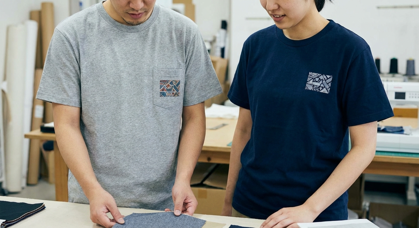
If the shirt has a real pocket, treat the pocket panel as the boundary. Avoid printing across pocket seams.
- Actual pocket: size to the pocket panel (often ~3–3.5 in wide) and keep clear of stitching
- Simulated pocket: use standard left chest sizing, but keep it visually “pocket-scale”
- Embroidery-style sizing: often smaller than print because stitch density favors simpler shapes
Sleeve Print Placement: Sizes & Measurements
Sleeve prints look best when centered in the sleeve “panel” between the shoulder seam and sleeve hem.
Because sleeves curve, avoid letting key elements wrap toward the underside where they’re harder to see.
Standard sleeve logo/text size and orientation
- Typical size: ~2.5–4 in W × 2.5–4 in H
- Placement: centered between shoulder seam and sleeve hem; stay clear of the underarm curve
- Orientation: vertical for text strips; horizontal for compact marks
Long-sleeve placement notes (if applicable)
Long sleeves wrap more than short sleeves, so very wide designs can be hard to read from one angle.
- Forearm print: ~2–3.5 in W × 10–14 in H (vertical)
- Bicep mark: ~3–4 in on the longest side
- Clearance: keep ~1–2 in above the cuff seam
Sizing by Shirt Size (S–3XL) and Youth/Unisex Considerations
The biggest production decision is whether to use one print size for all garments or scale (grade) the artwork by size.
One-size prints reduce complexity. Grading improves proportionality, especially for large graphics.
Do prints need to be scaled for different sizes?
- One-size works best for: left chest logos, small center chest prints, simple sleeve marks.
- Grading works best for: jumbo fronts, full backs with dense detail, designs near maximum printable width.
- Rule of thumb: increase width by ~0.5–1 in from S/M to L/XL, and again from L/XL to 2XL/3XL, while keeping top-of-print offsets consistent.
Youth tees vs. adult tees
Youth tees are narrower and shorter. Adult placements often look too low and too wide.
- Youth full front (typical): ~8–10 in W × 10–12 in H
- Youth left chest (typical): ~2.5–3.5 in on the longest side
- Placement height: often ~0.5–1 in higher than adult
Women’s fitted tees vs. unisex tees
Fitted tees tend to be narrower through the chest and shorter in the sleeves. Wide graphics wrap sooner, and straight lines can curve across the bust.
- Adjustment: reduce full-front width by ~0.5–1.5 in vs. unisex
- Sleeves: use smaller sleeve marks to avoid wrap on shorter sleeves
- Best approach: test placement on the exact blank and confirm with a sample
How to Measure Print Placement (So Your Mockup Matches the Final Tee)
Accurate placement is mostly about using the same reference points every time. When your method is consistent, your mockups match production and reorders stay predictable.
Tools and references
- Tape measure or ruler (in inches)
- The exact blank shirt model (if possible)
- Masking tape or tailor’s chalk for temporary marks
- Reference points: collar seam, shoulder seams, armpit seams, hem, and a centerline fold
Step-by-step measuring method
- Lay the shirt flat on a hard surface. Smooth wrinkles without stretching the fabric.
- Find the centerline by folding the shirt in half vertically (match shoulder seams and hem). Lightly crease or mark the fold.
- Mark the top-of-print point by measuring down from the collar seam (for example, 2.5 in for a full front).
- Box out the print area by measuring half the width left/right from the centerline, then measuring the full height down.
- Check clearance from side seams and the armpit curve. Adjust if the box crowds curved areas.
- Re-check symmetry by measuring from the box corners to nearby seams on both sides.
Artwork setup tips (print-ready files)
- Work at final size: build the file at the intended print width and height (in inches).
- Resolution target: 300 DPI at final size for raster art (use vector for logos and type when possible).
- Use a safe zone: keep critical elements ~0.25–0.5 in inside the outer edge.
- DTG/DTF note: confirm transparent backgrounds and keep fine details away from edges where trimming or slight misalignment is most visible.
Common T-Shirt Print Placement Mistakes (and How to Avoid Them)
Most placement problems are predictable: too high, too low, or too wide. A small measurement change usually fixes it.
If the order is large, validate placement on at least one physical blank before running production.
Print placed too high or too low
- Too high: the design feels like it’s crowding the collar.
- Too low: the design drops toward the belly and feels off-center when worn.
- Fix: use a standard collar offset (often 2–3 in for full front/full back), then check a flat-lay mockup photo.
Design too wide for the garment
- Symptom: art wraps into the side seams/armpits or looks stretched when worn.
- Fix: cap width by size class and create a smaller version for S–M.
- Tip: if the art has a border, increase inner padding instead of pushing the outer border wider.
Ignoring print method limits
- Screen printing: screen size and setup affect max art and placement flexibility.
- DTG: platen size limits jumbo dimensions.
- DTF: sheet width and trimming tolerance affect edge-to-edge goals.
Detail warning: Very small reversed-out text (light text knocked out of a dark fill) can fail in many processes. If it must be small, simplify, thicken strokes, or enlarge.
Copy/Paste Spec Examples (Send to Your Printer)
Clear specs reduce back-and-forth. Include placement, size (W×H), and distance from collar seam, plus alignment notes.
Example specs: front + left chest + sleeve set
- Front (full front): 11 in W × 15 in H; top of art 2.5 in down from front collar seam; centered on shirt centerline; keep ≥ 1 in from side seams.
- Left chest: 3.5 in W × 3.5 in H; top of art 3.5 in down from front collar seam; aligned to wearer’s left using centerline reference.
- Right sleeve: 3 in W × 3 in H; centered between shoulder seam and sleeve hem; keep clear of underarm curve.
Production note: “Please confirm max printable area for this blank and method before printing. If needed, adjust proportionally while keeping the placement offsets.”
Example specs: full back event tee
- Back (full back): 12 in W × 16 in H; top of art 2.5 in down from back collar seam; centered on back centerline.
- Optional yoke logo: 4 in W × 2 in H; top of art 1.5 in down from back collar seam; centered.
- Size policy: “Use the same back print size for S–XL. Increase to 13 in W × 16.5 in H for 2XL–3XL if printable area allows.”
FAQ: T-Shirt Print Placement and Sizing
What is the standard size for a full front t-shirt print?
For adult unisex tees, a common standard is 10–12 in W × 12–16 in H, with the top of the print about 2–3 in below the collar seam.
Go narrower for fitted tees and youth sizes. Consider grading up for 2XL–3XL if you want the design to keep a “full-size” look.
How big should a left chest logo be?
Most left chest logos are 3–4 in on the longest side.
Keep it compact for a clean look, but don’t shrink it so much that text becomes unreadable.
How far down from the collar should the design start?
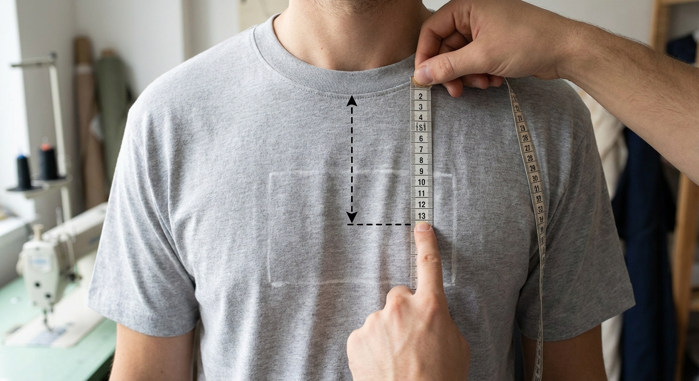
Common starting points are 2–3 in down from the collar seam for full front and full back prints.
For left chest marks, start around 3–4 in down, depending on collar depth and the blank.
Should I use the same print size for S to 3XL?
Usually yes for left chest and small center chest designs.
For full front/full back (especially jumbo graphics), grading often looks better. A simple approach is one size for S–XL and a modest increase for 2XL–3XL when printable area allows.